This year, interiors are stepping away from muted minimalism and embracing something bolder, moodier, and more immersive: colour drenching. It’s one of 2025’s most striking home décor trends, and it's turning heads (and entire rooms) in the best way.
But what exactly is colour drenching—and how do you make it work in a space without overwhelming it?
Let’s break it down.
Colour drenching is the art of using one colour, or tonal variations of it, across an entire room—walls, ceilings, skirtings, furniture, and even decor. The result? A space that feels cohesive, immersive, and dramatically styled.
Think of it as the opposite of an accent wall. Here, everything blends, building a rich, enveloping atmosphere that feels thoughtful and elevated.
Colour drenching taps into the growing design shift towards emotive interiors. People want their homes to feel more intentional. Instead of layering contrasting tones, colour drenching simplifies the palette while amplifying the feeling.
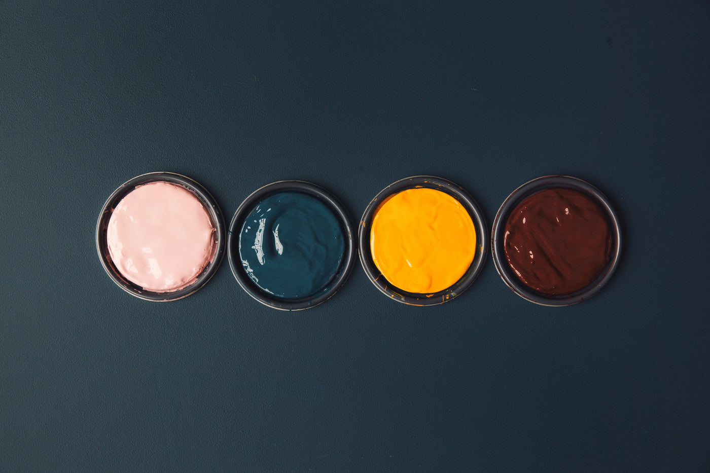
Whether you’re after calm (hello, sage green), drama (deep indigo), or creative energy (warm terracotta), a single-colour story can totally transform a space.
You don’t need to repaint every surface to dip into this trend. Small styling updates can achieve the same effect, especially when combined with clever decor. Here’s how to try colour drenching in a liveable, layered way:
Take inspiration from colours that resonate with you and the mood you want to set. You may do this from being inspired by an object in your space or by one of the pieces from the White Moose Collection.
Slate grey for moody sophistication
Terracotta for warmth and grounding
Soft clay neutrals for a calming base
Once you’ve chosen your tone, extend it across walls, trims, and ceilings if you’re ready to go all-in. Otherwise, paint walls and keep the rest tonal with furniture and décor.

This is where White Moose steps in.
✔️ Gold Table Snail or Black Snail
Use one of our best-loved creatures on a shelf or console to either match your tone or create subtle contrast. The black snail works beautifully in charcoal-drenched spaces, while the gold version adds luxe to warm neutrals.
✔️ Budgie Trio
Style the soft white budgies against a clay-pink or muted terracotta wall for a soft tonal effect that doesn’t scream for attention but still holds space.
✔️ Melbourne Tram Bookends (White or Gold)
Place them on a tonal shelf with colour-matched books to build depth. These are ideal for home offices or reading corners that follow a singular colour palette.
✔️ Cockatoo Sculptures (Black or White)
Let them perch in a matching or complementary tone zone. Black cockatoos pair well with navy and slate rooms, while white pops softly against dusty sage or warm grey.
To keep your drenched palette interesting, introduce texture and sheen instead of colour. Flat-toned furniture? Try metallic or brushed details to create contrast without breaking the palette.
Colour drenching might sound intimidating at first, but once you embrace it, you’ll see how grounding and cohesive it can feel. Whether you’re updating a single room or going full-home bold, this trend lets your personality shine through every corner.
And remember—White Moose décor is made for spaces with soul. Our statement pieces are designed in Melbourne to bring personality, playfulness, and polish to any room.
Ready to style your own drenched space?
Shop our latest pieces here and make your mark on a home that’s anything but boring.